


-
Posts
-

By leehyungsoo · Posted
Hello everyone, I am looking to purchase a Premium Lineage 2 High Five server pack. My main requirements are: Stability & Quality (Most Important): The pack must be highly stable with no system errors or major bugs. Custom Features: It must include ready-to-use custom features such as a fully functional Community Board, custom NPC Buffers, and Custom Item Sellers (GM Shops), etc. Complete Files: It is absolutely necessary that the full source code (src) and complete Geodata are included. If you are selling a pack that meets these criteria, please send me a PM or leave a reply with the following information: Brief details and key features of the pack Price Test server availability (I would like to test it before buying) Thank you! -
By vasilachykikol · Posted
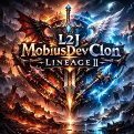
L2jmobiusDevClon — Classic Interlude p110 Emulator L2jmobiusDevClon is actively developing a Lineage 2 Classic Interlude p110 emulator. Development is done in free time with a strong focus on: • Stability • Authentic Classic mechanics • Clean and optimized architecture The project is based on the L2jMobius source and is continuously evolving and improving. System Requirements: • Java 25 • MariaDB 12.0 • Client p110 Current Revision: 3.0 Development Status: Active Distribution: Free Official Website: https://www.l2jmobiusdevclon.pp.ua Discord Server: https://discord.gg/23a9S8g4Bn Contact: Telegram — @L2jmobiusDevClon Also available via private messages Project Goals: ✔ Improved stability ✔ Maximum Classic accuracy ✔ Core optimization We are currently looking for: • Testers • Server administrators Suggestions, bug reports, and ideas are always welcome. Contact us via: ✔ Discord ✔ Telegram ✔ Private Messages -

By puredemonsss · Posted
i guess loading only the effects that are needed it will maybe work, like removing from reshade shader folder the ones that are not needed, depends on the pc also i guess, also limithing the game at 30fps can be better maybe -
 do you have protocol 311?
 -

By amtopseller · Posted
Up SELL CHARACTERS L2 REBORN FRANZ x1 destroyer 74 lvl naked - 120 euro sws 71 lvl naked - 120 euro pp 66 skills - 120 euro se 64 lvl - 90 euro Characters are legit with mail i can wtt the characters for adena server franz sell adena franz 250kk stock add discord topeseller4081
-
-
Topics
-


Recommended Posts
Create an account or sign in to comment
You need to be a member in order to leave a comment
Create an account
Sign up for a new account in our community. It's easy!
Register a new accountSign in
Already have an account? Sign in here.
Sign In Now