


MasterDisaster
-
Posts
7,642 -
Joined
-
Last visited
-
Feedback
0%
Content Type
Articles
Profiles
Forums
Store
Everything posted by MasterDisaster
-
one for the comeback.
MasterDisaster replied to MasterDisaster's topic in Graphics/GFX General Discussion
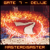
Sorry for not answering to this before. I was in a hurry, as far as I can remember :P I've used some kind of c4d's, a fire-like effect and a smudge effect(black dots up right). :D -
χαλαρά και βλέπουμε :Ρ
-
one for the comeback.
MasterDisaster replied to MasterDisaster's topic in Graphics/GFX General Discussion
Thanks! More to come :0 -
[FG's GFX Topic]Want a signature?Request it here
MasterDisaster replied to FinalGod's topic in Requests & Help
Well, I'll ask for something unique :) Text: MasterDisaster Subtext: Up the Irons! Theme: trivium logo / disturbed's "mascot" named " The Guy" -
one for the comeback.
MasterDisaster replied to MasterDisaster's topic in Graphics/GFX General Discussion
thanks for the comments everybody. @fg I know I overdid a little bit. @observer, yeah I'm kinda back :P -
well, i'm clueless with illustrator. Sorry :/
-
download it solo. I mean, just download it without the others. Install and it may work.
-
Photoshopped after a month or so... Way to go still....
-
I listen to music all day (and night) long. I have made specific playlist according to what I feel like. I have one for being happy, one for being in love, one for the break-ups and one for action games. When I'm photoshopping I always have music playing, no matter what it is. Most of the times I listen to my favs like 3dg,judas priest, skillet, bfmv, nightwish, maiden, iced earth, dio, planet of zeus, sonata arctica, sabaton, trivium and many many more bands. It's must to have music playing, while photoshoppin' imo . It helps your creativity as well. Many of my tags are music-inspired.
-
για να δούμε...
-
http://www.redplanet.gr/podosfairo/oloi-sthn-ollandia.1874386.html
-
[HELP] Suggest me fonts for this signature!
MasterDisaster replied to KaMiKaZe69's topic in Requests & Help
why? you could end up with great results. -
I think that it lacks of depth, since i can't concentrate on the focal from the first view. Then, what to say? It's so good-looking. GJ!
-
that's so fkn better than what you used to do in the past. Well, I totally like it. Thing is, it lacks of depth...You know, sharpen the focal, blur the background.(don't overdo it tho ;) ) Plus, the lightning effects are kinda fak'd up. Nice effort. Keep it up ;)
-
SOTM #2: Super Heroes - The Voting Thread
MasterDisaster replied to MasterDisaster's topic in SOTM Events
Thread locked. I'll make a new thread with the winners and so on tomorrow. -
It's my fault. (and mixmaster's probably but that's another story). If I fail to change the way things in these sections are, the next week, I'll ask for my demotion.
-
[HELP] Suggest me fonts for this signature!
MasterDisaster replied to KaMiKaZe69's topic in Requests & Help
my suggestion would be to check the top rated fonts @ dafont. None could show you the best font to use. it's based on what you wanna achieve with your text. Plus, don't use only text layers for text. Give it some effects via blending options, brushes and smudge :) -
tell me what do you need exactly.. If you're a starter, then I'll post some pretty basic things you gotta know.
-
να το ονομάσουμε facebook το τόπικ, εκεί θα συζητάμε σε λίγο καιρό! (i mad)
-
OK THANKS ΠΑΊΔΕΣ. ΤΟ ΚΛΕΙΔΩΝΩ <3
-
αυτό <3
-
ok
-
οκ νομίζω πως κάτι βρήκα. Βασικά υπήρχε ένα site, ελληνικό warez style. Άλλαξε και όνομα πέρυσι και είχε το "greece" mέσα αν θυμάμαι καλά. SimpleGR ή κάπως έτσι.
-
δεν έχει υπότιτλους.. να κατεβάζω θέλω ρε..
-
καλά, ανέβηκες α' και νομίζεις πως κάτι έκανες.