


Commodus
-
Posts
5,316 -
Credits
0 -
Joined
-
Last visited
-
Feedback
0%
Content Type
Articles
Profiles
Forums
Store
Posts posted by Commodus
-
-
Ennoouse na min tou doseis kateuthian to link gia na kanei download ta npc alla na psaksei monos tou na ta brei.
Alla efoson tou ta edoses kai to problima lithike ok ;)
-
Sinisto l2j dot an prokite gia interlude server.
More info : www.l2dot.info/forum
-
Prospathise na peraseis ena new system sto client sou.
An auto den doulepsei kai sou bgazei pali auto to error anikse to system sou kai kane delete auto : obscene-e.dat
Elpizo na se boithisa.
-
to ekana alla kathe fora pou pataw se ena buff mou vgazei script error...

Afou sou leei re anthrope giati sou bgazei to error.
Pigene kai anikse to init py kai sbise oles tis grammes pou periexoun to restore HP,MP.
Prosexe omos na tis SBISEIS OLES TIS GRAMMES giati tha sou bgazei pali auto to error.
Otan telioseis kanto save,kane restart ton server kai eise ok.
-
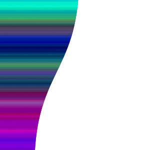
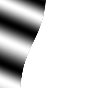
Hello,here i will show you a guide how to create a random lighting layer.
1 – Creating some wavy patches
Make a new image, 6000 pixels wide and 4500 pixels high. With the default black and white selected, click Filter > Render > Clouds. Clouds are an excellent way to create randomness.
Turn the clouds into coloured patches, by clicking Image > Adjust > Brightness/Contrast. Set the Contrast to +100. You can also alter the size of the patches by changing the Brightness.
Zoom out (Press Ctrl -) and select about a quarter of the image (you can do it precisely if you like).Click Image > Crop. (The image was made bigger to make the clouds smaller.)
Click Filter > Distort > Wave. Increase the wavelength to Minimum 200, Maximum 300, and increase the maximum amplitude to 50. Randomise the waves until you've got a nice effect, and click OK.
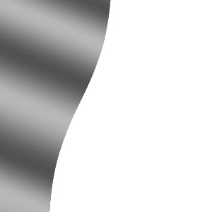
2 – Making a Noise Gradient
Create a new layer. Choose the gradient tool. Click on the coloured representation of the gradient. Choose Noise Gradient. Apply the gradient across the image.3 – Canopy Lighting
Desaturate the layer, by pressing Ctrl+Shift+U. The colours of a Noise Gradient aren't useful here, but it's a good source of randomised lighting when desaturated.
Change it from "Normal" to a Hard Light layer (Adobe Photoshop 6.0) or a Linear Light layer (Adobe Photoshop 7.0.)
This noise gradient layer creates what I call "Canopy Lighting" - visible, unidirectional lighting, with a myriad of different intensities - as if it had gone through the randomising effect of a forest canopy.
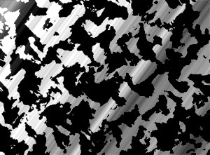
The problem with this lighting layer is that it doesn't show up over the black areas.
4 – Adjusting the light
To make the light visible everywhere, select the cloudy background layer and click Image > Adjustments > Brightness/Contrast. Reduce the contrast to -75%. (This makes the white a light grey, and the black a dark grey, so they'll both be affected more by the Canopy Lighting layer.)
If you do this tutorial again, instead of changing the contrast, just increase the layer's lightness by about 40.
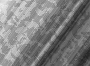
5 – Adding some colour
Go to your background layer and alter its Hue/Saturation, by pressing Ctrl+U. Tick "Colorize". Play with the Lightness and Saturation, and select a Hue (colour).
I've used this canopy lighting effect for a number of sites I've made. It also makes a very nice wallpaper.
Click on the link below for a full screen version. To set it as your wallpaper, just right-click it.
Enjoy ;)
-
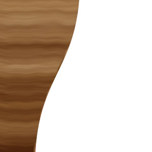
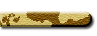
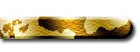
Hello,here i will show you how to create a realistic wood texture.
1 – Creating an area for the Wood Texture
Select an area that you'd like to give a wood texture to, and fill it with a brown colour. I created my shape using the Freeform Pen Tool, but that's optional.2 – Adding a Gradient
Create a new layer, but keep the area selected. Click on the Gradient Tool, and click on the visual representation of the gradient. Change it from Solid to Noise. Keep randomising it until you're happy with it. Apply the gradient vertically. Hold Shift to make it exact. (In Adobe Photoshop, holding down Shift will make most tools function in a straight line.)3 – Adding another Gradient
Make another layer, and repeat the process. (Remember to click on the visual representation of the gradient and randomize it.) Each of these layers helps to form the grain of the wood texture.
4 – Yet another Gradient
And one more. :) (This gradient is very funky, but I was worried about the very dark bit at the bottom.)
5 – Altering the Gradient Layers
Desaturate each of your gradient layers, by clicking on it and pressing Ctrl+Shift+U. This makes them greyscale.
Change all the gradient layers from Normal to Soft Light.
For each gradient layer, click Filter > Distort > Wave. Set both Amplitude sliders to 1. Randomise the waves until you're happy with them. This slight wave is more typical of a real-life wood texture.
6 – Adding light, with... a Gradient!
To brighten up the wood texture (I hope you still have the area selected), fill it with a black-white-black-white gradient. To do this, click on the visual representation of the gradient, and put in a few new black and white tabs.Apply the gradient at a slight diagonal across the image.
7 – Softening the Light
Click Image > Adjustments > Brightness/Contrast, and lower the Contrast. If this isn't done, the lighting will be very harsh, and your nice wood texture will look more like the door to a crypt. :)
Change the layer from normal to Overlay.
8 – The Finishing Touches
Done! Double-click your base wood texture layer, and give it a Bevel and Drop Shadow for extra effect.
Select the base wood texture layer and press Ctrl+U. Play with the sliders until your wood texture is golden brown. :)
Enjoy ;)
-
Hello,here is a guide how to create buttons for your website!!
1 – Creating the button shape
In a new layer, select a circular area with the selection tool. (Holding down Shift will make the selection stay circular, rather than being elliptical.) Fill the area with the paint bucket. This is the curved end of your web button.2 – Selecting a column for extension
Zoom in (Ctrl +) and select a one-pixel wide area in the centre of the circle. You can use the normal Selection Tool to do this, or you can hold down on the Selection Tool, and choose the Single Column Marquee Tool.3 – Extending the button shape
With your one-pixel sliver of the web button selected, press Ctrl+T to "Free Transform" the selection. Extend the selection to the left as far as possible.
4 – Colouring Your web button
Press Ctrl+U to bring up the Hue/Saturation properties of the layer. Click "Colorize". Drag the sliders around until your web button has a nice colour.
5 – Giving the button some Effects
In the layers list, double-click this layer (Photoshop 6.0 and 7) or right-click it and select "Effects" (Photoshop 5). Give your web button a Drop Shadow and a Bevel.
6 – Texturising the button
Click Filter, Texture, Texturizer. Choose Sandstone. I use this texture for most web buttons I do these days.
7 – Adding random colour variation
Create a new layer.Click Filter > Render > Clouds (If your background isn't white, you'll first need to select the area of the button, by holding Ctrl and clicking on the button's layer in the layers list. This keeps the clouds inside that area.) Click Image > Adjustments > Brightness/Contrast. Set the contrast to maximum. (This turns the random grey clouds into equally random patches of black and white.)
Change the new layer from Normal to Overlay. (This changes the layer from solid colour to a kind of illumination, as if it were cellophane over the web button layer, instead of coloured paper.)
8 – Adding light to the button
Make another new layer. Choose the Gradient tool. Click on the visual representation of the gradient (Adobe Photoshop 6.0 and 7). In Adobe Photoshop 5.0, click the Options tab first.On the visual representation of the gradient, put in several tabs. These tabs should be in a black, white, black, white pattern.
Apply the gradient to your image, and change the layer's Mode from Normal to Overlay. This should give the button some nice illumination.
9 – Adding text to the button
Using the Text tool, add some text to your button. Some useful tips for button text are:1)Make the button text all capitals.
2)Increase the tracking (letter spacing). It makes the text more dramatic.
3)Make the first letter of each word two points larger.
4)Make the first letter of each word red (pale yellow for white text.)
5)Use Palatino Linotype font in place of Times New Roman.
Note: you can only change the colour of individual letters of the button in Photoshop 6.0 and 7. In Photoshop 5, you'll have to right-click the layer in the Layers list, and render it, then lasso the letters you want to change, then Press Ctrl+U to colour-shift them. Most annoying. :)
10 – Embellishing the button text
Double-click the text layer (Photoshop 6.0 and 7.0) or right-click it and select "Effects" (Photoshop 5). Give it a Bevel and a white Outer Glow. I've also put a black outline on the button layer, to make it stand out more, but that's optional.
Here You Are...!! ;)
-
Here its an Greek Section so try to speak greek.
Thanks.
-
Orea tha pas na kaneis edit to server status sou kai tha grapseis :
~~~~Status~~~~
Login:~~
Game:~~
Epita tha pas http://www.blackout-gaming.net/ kai tha baleis tin ip me tin opoia exeis ftiaxei ton server kai to loginserver port (2106) kai to gameserver port (7777) antistoixa.
Meta apo auto tha sou bgalei diafora eikonidia pou tha dixnoun ton server sou online i offline,epelekse ena,kane copy to code pou tha sou exei kato apo auto to eikonidio kai kanto paste dipla apo to Login kai to Game pou exeis balei sto topic ''Server Status''.
-
Se merika packs doulevei autos o tropos pou leei o l2 magnus alla an exeis target enan player oti create item kai na kaneis tha ta emfanisis sto sakidio autounou pou exeis target.
Dokimase to an ginete etc kai kane post edo.
-
Very Good Guide ;)
Keep it up :P
-
Tha pas control panel -->page editor-->pages management-->Add new page(eine pano pano deksia)
-
Rocks !! Gj Mate.
-
Auto to warning sou to leei otan kapoios player oi kapoioi players trone critical i dc.
Gia to problem sou tora prospathise na deis ama fteei to system sou i ta custom pou exeis balei ston server(p.x an den ta blepoun ston server kai otan pane na ta agorasoun trone critical).
-
Ego prosopika den ksero polla apo SMF alla pistevo pos iparxoun polla atoma pou mporoun na se boithisoun ;)
-
Hello..!!!
Here i would like to present you my new signature..!!
Hmmm,what do you think??:P
-
Pigene gameserver/config kai anikse to file options.
Epita,bres tis grammes autes kai kantes edit me ton arithmo pou thes.
# Inventory space limits
MaximumSlotsForNoDwarf = 200
MaximumSlotsForDwarf = 200
MaximumSlotsForGMPlayer = 300
-
E DIABASE TO PROTO MOU POST POU SOU EKANA.
EDIT TIN IP TOU L2 INI SOU SE 127.0.0.1 KAI BES.
-
Re anthrope o server eine sto pc pou prospathis na beis??
-
Gia na se boithiso perissotero pigene :
gameserver/data/zones kai anikse to hml file ''zones''.
Ekei tha breis to meros pou thes kai tha edit tis sintetagmenes x,y,z.
-
Tha pas : gameserver/data/jscript/custom/9999_NPCBuffer kai tha edit to init.py sou.Ekei pistevo tha eine to problima gia na sou leei oti exeis problima me to quest.
-
Auto den eine to problima tou pack oute tou server.To problima eine sto pc sou..mipos iperthermenetai to pc kai klinei to connection tou internet sou??
-
File,ean den exei static ip kai alazei i ip tou me kathe restart tou modem tou tote fobame pos den boreis na kaneis kati.
I moni lisi pou tha se boithisei eine na baleis ena protect ston server sou oste na apofigis tetoiou eidous problimata.
-
ti ennoeis pos tha tous blepeis????an o server eine sto pc sou kai esy thes na beis apo auto tha baleis tin ip 127.0.0.1.
An eine se diaforetiko pc o server kai esy thes na pekseis apo allo tote edit to l2 ini sou me tin ip tou server sou.

 Zoom out (Press Ctrl -) and select about a quarter of the image (you can do it precisely if you like).
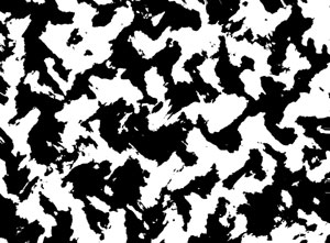
 Create a new layer.
 Choose the gradient tool. Click on the coloured representation of the gradient. Choose Noise Gradient. Apply the gradient across the image.
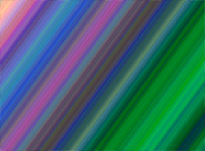


 In a new layer, select a circular area with the selection tool. (Holding down Shift will make the selection stay circular, rather than being elliptical.)
 Fill the area with the paint bucket. This is the curved end of your web button.


 Using the Text tool, add some text to your button. Some useful tips for button text are:

Pws mporw
in Request Server Development Help [Greek]
Posted
Pigene gameserver/config/options kai bres auth th grammh :
#------------------------------------------
# Chance for Augmentation bonus in %
#------------------------------------------
AugmentBasestat = 1
AugmentSkill = 10
Epita bale ton arithmo pou thes gia na pianoun ta aguments skills(se % panta)